Today I want to talk about one of my most favorite things, color and choosing paint colors for acrylic pouring!!
Color!
Color is seriously one of the things that inspires me most in my home and my art. I could look at different color combinations all day.
But many people feel overwhelmed about choosing paint colors for acrylic pouring and often fall into the pattern of choosing the same colors over and over.
So I created this post to go in-depth about the technical side of color and color schemes. In doing so, I’m hoping that you will find that there are ways to choose colors for your acrylic pouring that you may not have thought of on your own that you can feel confident look good together.
Basics of Color
Qualities of Color
There are three qualities that make up color: hue, value, and intensity. Hue is the actual color as named, red, blue, yellow, etc. Value is the lightness or darkness of a hue. Adding white or black to a hue changes the value. The intensity of a color refers to the brightness and purity of the color. High intensity colors are strong and bright, and low intensity colors are faint and dull.
Categories of Colors
Primary Colors
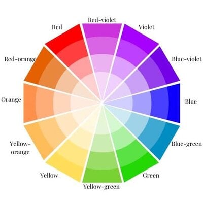
Red, blue, and yellow are primary colors. You cannot make primary colors by mixing any other colors. In fact, primary colors can be mixed to make all other colors.
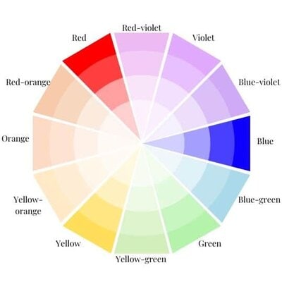
Secondary Colors
Orange, green, and violet are secondary colors. They are formed by mixing the primary colors.
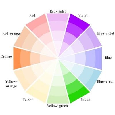
Tertiary Colors
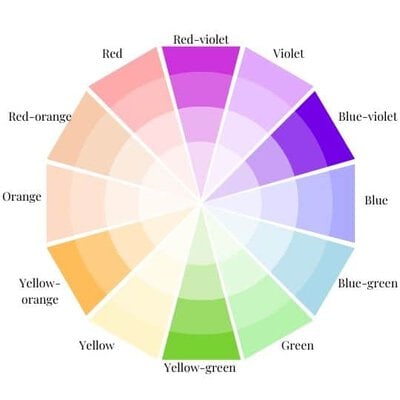
Yellow-orange, red-orange, red-violet, blue-violet, blue-green, and yellow-green are tertiary colors. They are formed by mixing a primary color with a secondary color, as reflected by their names.
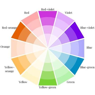
Groups of Colors
Colors can be grouped in many different ways, but three of the most common groups are neutrals, warm colors, and cool colors.
Neutrals
A neutral is a color that can be paired with any other color. The five neutrals are considered to be white, black, gray, beige, and navy blue. There are tons of variation in hue, value, and intensity within these five colors and therefore still a ton of room for creativity within neutrals.
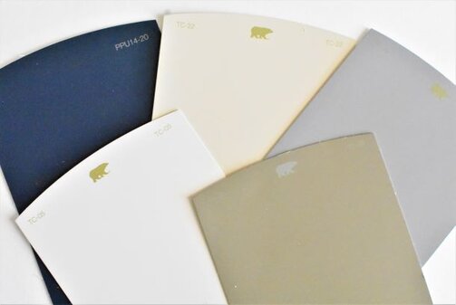
Warm Colors
Red, orange, and yellow are generally considered to be warm colors. The colors between these on the color wheel are considered warm as well. It’s no wonder why these would be considered warm colors as they are reminiscent of the sun and fire.
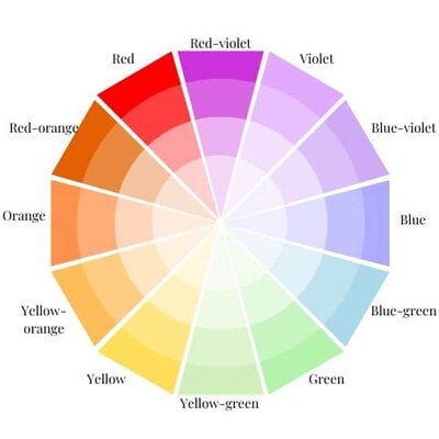
Cool Colors
On the opposite side of the color wheel, we have cool colors, green, blue, and violet as well as the colors between them. These are reminiscent of things like water and the sky.
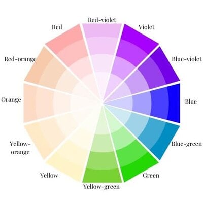
How does this help?
So I’m sure you’re all thinking, “Color theory is great and all, super interesting (at least that’s what I’m thinking, ha!), but what does this mean for me when I’m choosing paint colors for acrylic pouring? Why does any of this matter, and how is it going to help me?”
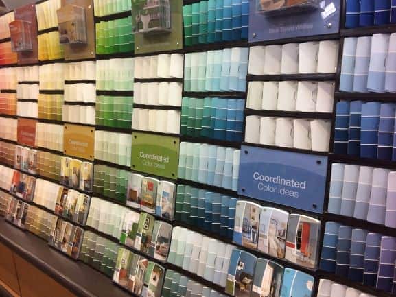
Well, the fact is choosing paint colors can be daunting. We’ve all done it, walked into Michael’s or some other craft store and been totally overwhelemed. What do you choose? What colors go together? How do you get the feeling you’re looking for?
Color theory is a tool that you can use to answer these questions and to give you a direction to move in when you’re choosing colors for acrylic pouring.
For the sake of this post, I will be using paint chips to demonstrate colors because it’s an easy way to visualize color that most of us are very familiar with.
Grab your FREE printable color wheel and 8 color scheme guides and follow along!!!
Types of Color Schemes
So first things first, there are six main types of color schemes that you can employ when choosing paint colors for acrylic pouring: monochromatic, complementary, analogous, split complementary, triadic complementary, and tetradic. Using these schemes can help you ensure that your colors will not clash and will be visually appealing together.
Monochromatic
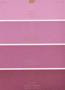
A monochromatic color scheme is made up of colors that are different values of the same hue. A practical example of this is those paint chips that you pick up at the store. If you poured with just the colors from one of those chips, which are different values of the same hue, that would be a monochromatic color scheme.
Complementary
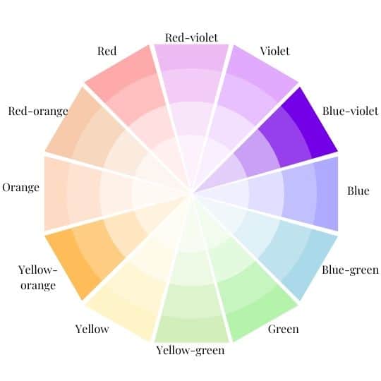
Complementary colors can be found directly across from each other on a color wheel. For example, red and green, yellow and violet, blue and orange, etc. Christmas decorations, the traditional red and green ones, are a great example of a complementary color scheme.

Analogous
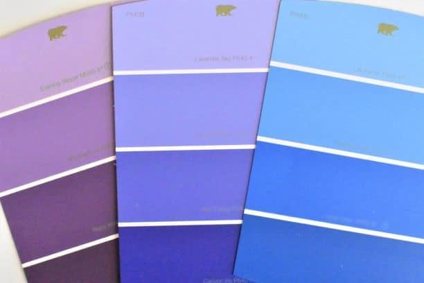
Analogous colors are right next to each other on the color wheel. So if you head back to that paint chip wall at Home Depot, you’ll find that similar colors are next to each other. If you choose colors that are next to each other for your pour, you are employing an analogous color scheme.

Split Complementary
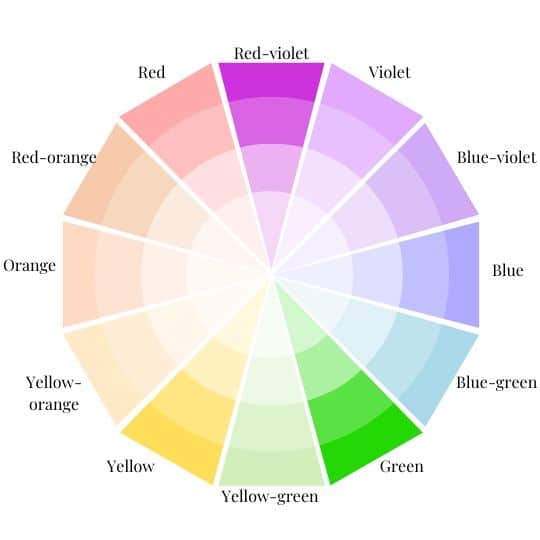
A split complementary scheme consists of three colors, one and then two other colors that are equally spaced from its complement on the color wheel. Split complementary schemes are great when you’re looking for high contrast but with a little bit more visual interest than the standard complementary scheme.
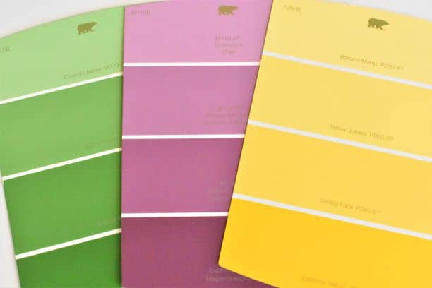
Triadic Complementary
In a triadic complementary scheme there are three colors that are spread equally apart on the color wheel. Similar to split complementary schemes, triadic complementary schemes provide contrast and visual interest.
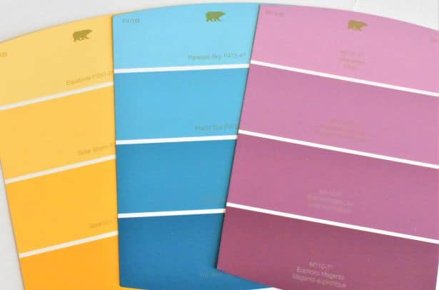

Tetradic
A tetradic scheme, sometimes referred to as a double-complementary scheme, consists of two sets of complementary colors. The distance between these pairs will determine how much contrast is in the overall scheme.
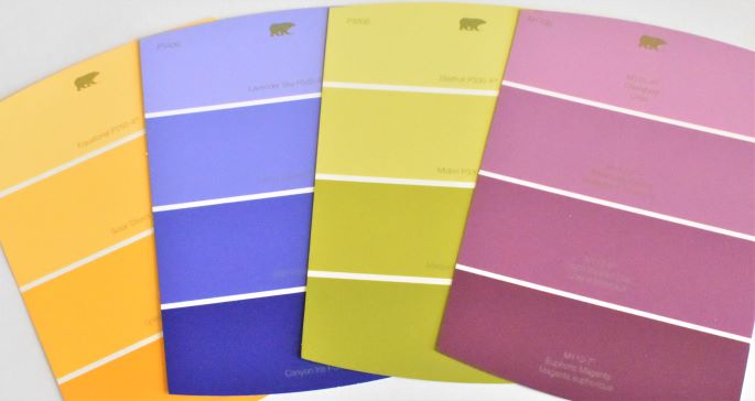
Practical Considerations for Choosing Paint Colors
Aside from the theoretical aspect of choosing paint colors, there are practical considerations that you should make as well if you are pouring art for a specific space, such as:
Who will be occupying the space?
This is totally going to seem obvious, but if you are creating art for someone, you should think about that person. What style do they prefer? Do they have a favorite color? Favorite sports team, hobby, animal, or place you could base a color scheme off of?
What type of mood or feeling are you looking to create in the room?
Certain colors evoke certain feelings and moods. For instance, blues and greens tend to give off a relaxing vibe, so you might want to use something like that in your bedroom. Warm colors, like reds and oranges, have high energy and are used to represent things like strength and passion. Mostly, you’ll want to think about what that color makes you or the person who will be occupying the room with your art feel.
If you’re really into the meaning of specific colors, when you get your Free Color Wheel and Color Scheme Guides, you can also purchase a helpful pouring printable pack that includes a Reference sheet for the meanings of all the colors.
Are there other colors in your home that you need to incorporate or consider for a cohesive look?
When you’re thinking about a bedroom that ends up closed off much of the time, it doesn’t matter as much if it goes with the rest of the house, per se, but if you’re working with one of the open spaces in the house, like the kitchen or living room, you’ll want to think about how the colors you already have in the home will look next to the colors in your painting.
You may even want to incorporate the colors from your painting into the scheme to create a cohesive look. This is not to say that you have to use the same colors, but even just having some accessories in your existing colors will help bring the house together.
Ideas and Inspiration
Now, I know what you’re thinking, okay, that’s great, now I know how to plan a color scheme and I have some idea of what I should think about, but I still have no idea where to start with actually choosing paint colors. Luckily, nowadays there are plenty of places to get inspiration and ideas for choosing paint colors for acrylic pouring.
Premade Palettes
Premade palettes are a huge trend these days. If you’re having a creative block or looking for something totally new and different, these are a great way to get inspiration, ideas, and even specific paint colors. You can find these on Pinterest just by searching “color schemes.” You can also generally find these on the paint chip wall at the store.

A word of warning, however, some of these have upwards of eight or nine colors in them. That is often just too much for one painting and may end up muddied. Although, I have seen some amazing pours with an astounding number of colors, so it is doable; you may just lose some in the shuffle.
Fabric
One great way to come up with a color scheme for a painting is to pull colors from a fabric that you love. It is much easier to pull colors from a fabric than it is to try to find a fabric containing the color you’re looking for, so if you’re going to want to match fabric to art, you should choose the fabric first and work of of that. This is probably my favorite way to choose colors for acrylic pouring art for my home.
Artwork or Photos
If you have a photo or another piece of artwork that you like and plan to feature in your space or if you just like the feeling of the photo or artwork, you can pull colors out just like you would with fabric. In fact, many of the premade palettes that you find online are derived from photos.
Magazine or Pinterest Inspiration Pictures
Have you ever seen a picture of a space and just felt inspired? This happens to me sometimes with magazines or Pinterest photos. They really are an awesome way to get some ideas and inspiration. Oftentimes, too, they will have the name of the paint color somewhere in the article.
Go Forth and Play with Color!
I hope this post has given you the technical knowledge of color theory, confidence in developing color schemes, and inspiration for choosing paint colors for acrylic pouring! Be creative and have fun with it!
I love this subject sooo much that I did a whole 30-piece series on it, so if you’re looking for even more information, inspiration, or just to see that FREE printable color wheel and color scheme guides in action, click here to see my color theory series!
If you’re new to pouring, head on over to my Beginner’s Guide to learn all about the art form and how to get started as well as my Comprehensive Techniques Guide to check out videos for each different technique.
As always, check out my updates on Facebook and Instagram and feel free to peruse Homebody Hall for more fluid art tips, tricks, and tutorials! Also head over to Youtube and subscribe to get my videos sent to you as soon as they come out!!


