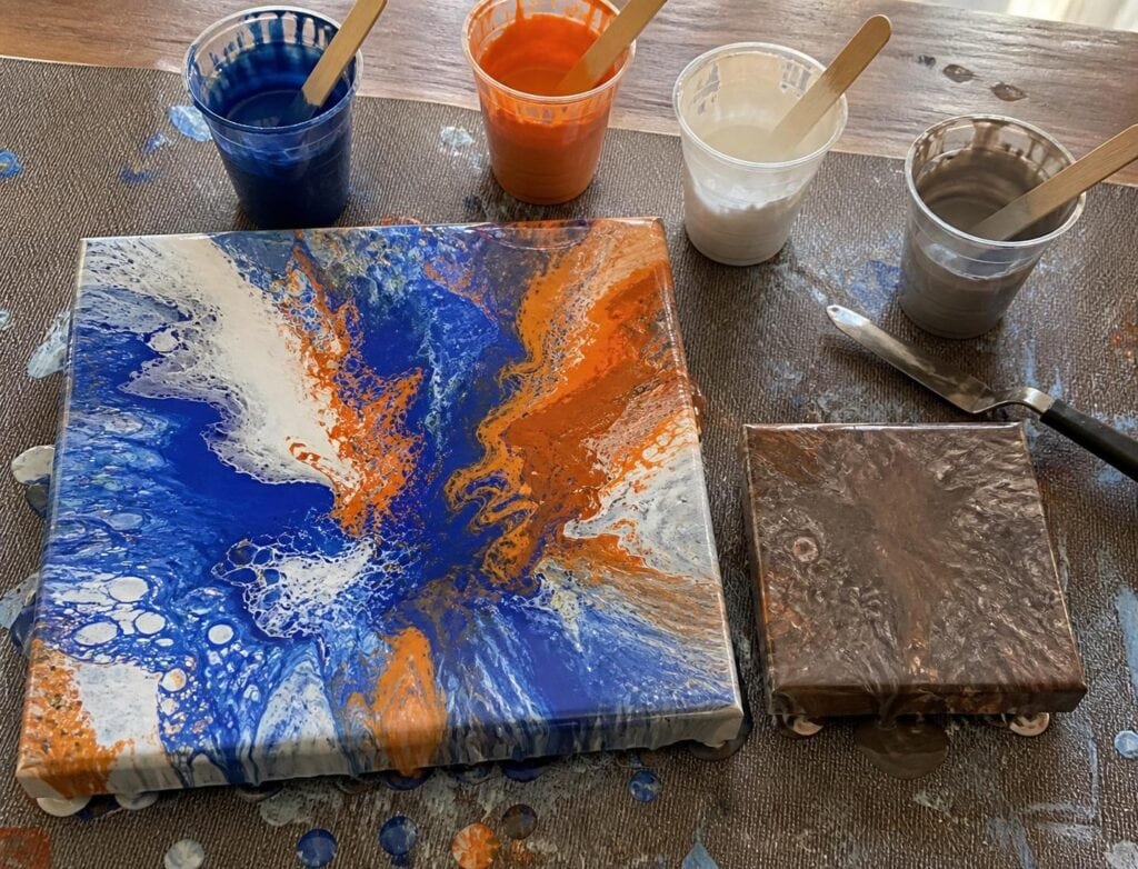
Complementary colors can make an acrylic pour feel electric. Blue beside orange, purple beside yellow, or red beside green creates the kind of contrast that makes cells, ribbons, and negative space stand out beautifully. Unfortunately, those same colors can create a murky brown or gray when they blend together.
I learned this after pouring what I expected to be a vivid purple and yellow piece. The colors looked wonderful in separate cups, but I layered them directly against each other in a flip cup, added too much paint, and tilted for far too long. By the time the canvas was covered, most of the center looked like wet cardboard.
The problem was not the palette itself. The problem was how I allowed the colors to meet.
Why Complementary Colors Can Turn Muddy
In acrylic pouring, there is an important difference between colors touching and colors physically mixing. Complementary colors are most vibrant when we can see them beside one another. When they churn together in a cup, under a swipe tool, or across a heavily tilted canvas, they begin neutralizing each other.
This does not always produce an ugly color. A small amount of mixing can create rich shadows, smoky transitions, or earthy accents. The trouble begins when that neutral mixture spreads through the entire composition and replaces the contrast you wanted.
I have noticed that muddy pours usually result from repeated movement rather than one brief moment of contact. The colors mix while being layered, mix again when the cup is flipped, and mix once more during aggressive tilting. If the paint is thin, every extra movement increases the blending.
Some pigments are also more assertive than others. A strong phthalo blue can quickly take over a soft orange. Dioxazine purple can overpower a pale yellow. The names on the bottles may describe a complementary pair, but the paints do not necessarily have equal tinting strength or opacity.
Build a Complementary Palette That Has Breathing Room
For beginners, I recommend using one complementary relationship as the foundation of the pour rather than combining several opposite pairs. Blue and orange are easier to manage when red, green, purple, and yellow are not also competing inside the same cup.
Start with one dominant color, one smaller complementary accent, and one or two supporting colors. A practical palette might include deep turquoise, light turquoise, a modest amount of copper orange, and white. Another could use plum, lavender, a restrained golden yellow, and warm white.
Changing the value of one color is especially helpful. Dark purple beside pale buttery yellow still gives you complementary contrast, but the value difference helps each area remain readable even if the edges soften. In my experience, using both complements at maximum intensity can look exciting in the cups but become visually noisy on the canvas.
One mistake I see often is using equal amounts of every color. Equal portions sound balanced, but they give the complementary accent too many opportunities to mix with its opposite. I usually let the dominant color occupy about half of the palette, use supporting tints for much of the remaining paint, and reserve the complement for smaller flashes.
This is a tradeoff. Using less of the accent color means fewer dramatic streaks, but the streaks that survive tend to look cleaner and more intentional.
Four Ways to Keep Opposite Colors From Overmixing
1. Place a Buffer Color Between Them
A buffer color creates a pause between complementary paints. White is the simplest option, although it can create pastel edges. Metallic gold, pearl, or a lighter version of the dominant color can also work.
For a blue and orange pour, I might layer blue, light blue, white, orange, white, and then return to blue. The orange is still visible beside the blue after pouring, but the colors are less likely to become one uniform neutral mixture.
Black can act as a divider, but I do not usually recommend it for a beginner complementary pour. It is powerful, can spread farther than expected, and may turn the entire piece darker. White or a pale related color is more forgiving.
2. Use Placement Instead of Hope
A large flip cup asks the colors to survive a great deal of internal movement. I prefer a controlled puddle pour or open cup ring pour when testing a complementary palette. These methods let me decide when the accent enters the composition.
Pour the dominant color first, add the supporting tint, and introduce the complement in thinner rings or smaller puddles. Leave some sections without the complementary color. That uneven placement often creates a more interesting composition and prevents every area from becoming neutralized.
A split cup can also preserve separation, but it is not automatically safer. If both complements pour into the same narrow stream and the canvas requires extensive tilting, they can still mix. The tool helps, but placement matters more.
3. Match the Paint Consistency
If the orange is thin and the blue is thick, the orange may run through and around the blue instead of staying in a defined ribbon. If the blue is much thinner, it may flood the composition and tint everything.
Before pouring, lift each paint with the same stir stick and watch how it falls back into its cup. I want similar continuous streams and similar mounds that disappear at roughly the same speed. Perfect measurement is less useful to me than observing how the paints actually move.
What surprised me most during my early experiments was how often a muddy result blamed on color theory was really a consistency problem.
4. Tilt Less and Stop Earlier
Complementary pours often look cleanest before we think they are finished. I eventually realized that my habit of chasing every last interesting cell was stretching and blending the colors until the strongest contrast disappeared.
Use enough paint to cover the surface without excessive travel. Tilt with a purpose, bring the composition over each edge, and return the visual weight toward the center. Once the canvas is covered and the main ribbons still look distinct, stop.
I gently disagree with the advice to keep tilting until the design feels completely balanced. In fluid art, extra correction can cost more than a slightly uneven composition. A lively orange passage on one side of a blue pour is often better than evenly distributed brown.
Simple Palette Tests Before the Main Pour
You do not need to sacrifice a canvas to discover how two pigments behave. I use small test tiles, sealed cardboard, or inexpensive ceramic coasters.
Place a small puddle of each complementary color side by side. Tilt once and observe the boundary.
Repeat the test with a narrow line of white or a tinted version of one color between them.
Layer a few spoonfuls in the same order planned for the main pour. Pour the mixture onto a tile without stirring.
Drag a craft stick through one small section. This shows the neutral color that will appear if the paints become heavily mixed.
Let the sample dry before deciding. Some colors dry darker, and metallic paints may become more prominent after the cloudy wet appearance clears.
Troubleshooting Complementary Color Pours
Why did brown appear around all my cells?
The complementary colors probably met repeatedly while the cells expanded. Reduce the amount of accent color, add a buffer, and avoid manipulating the surface after the pattern opens. If you use silicone, remember that more silicone does not protect color separation. It can encourage additional cell activity and movement.
Why did one color disappear?
Check pigment strength, opacity, and consistency. Try tinting the stronger color with white, using less of it, or choosing a more opaque version of the weaker color. A tiny test pour will reveal this faster than studying the bottle labels.
Can I use all three complementary pairs in one pour?
You can, but I would not begin there. Multiple complementary pairs create many opportunities for neutral mixing and make troubleshooting difficult. Learn how one pair behaves first. Once you can preserve clean passages of blue and orange, adding another relationship becomes a creative decision rather than a gamble.
Complementary colors do not need to be kept completely apart. They need controlled contact. Give one color dominance, change the value of its opposite, place a buffer where useful, and stop tilting while the contrast still feels alive. A little neutral color can add depth. The goal is simply to keep it from becoming the entire painting.
