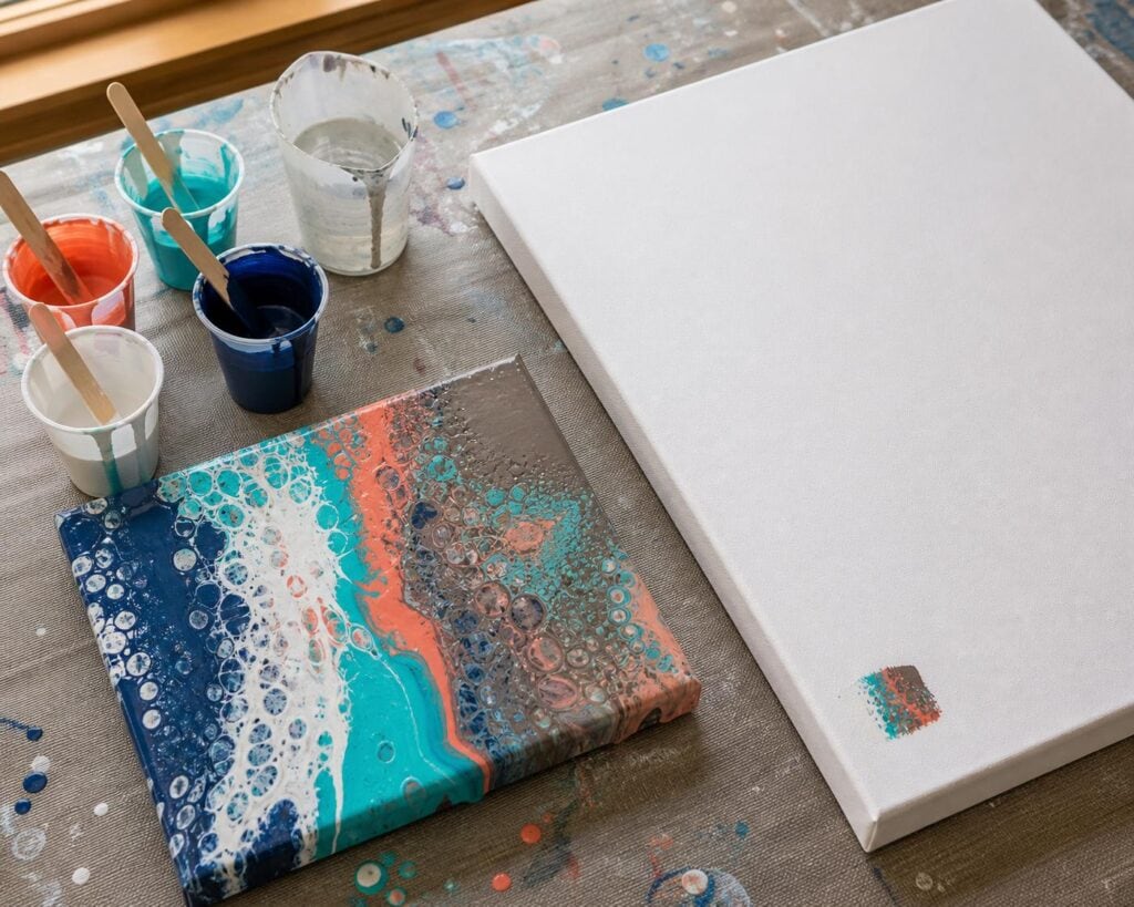
A large canvas can make an acrylic pouring idea feel exciting right up until you realize your white is swallowing the other colors, your paint will not move, or the beautiful palette in your head has turned into a muddy puddle. A small test pour gives you a chance to discover those problems while they are still inexpensive and easy to fix.
I learned this after pouring a carefully planned combination of turquoise, violet, gold, and white across a large canvas. The wet pour looked promising, but the gold was too dominant and the violet disappeared beneath the heavier colors. I had used a lot of paint to learn something I could have discovered on a five by seven canvas panel.
A test pour is not a perfect miniature prediction. Paint behaves differently when it has more distance to travel, and tilting a large canvas changes how the colors stretch. Even so, a thoughtful test reveals far more than separate color swatches ever will.
Why I Recommend a Small Canvas Panel
For beginners, I recommend testing on a small canvas panel rather than paper, cardboard, or a ceramic tile. A canvas panel is firm, affordable, and closer to the surface of a stretched canvas. It lets you tilt, stretch, and observe the pour without the severe warping that can happen with paper.
Tiles are useful for testing color interaction and cells, but paint often slides across them differently. Cardboard can absorb moisture and distort the result. Those options save a little money, but they can give beginners misleading information about flow. In my opinion, sacrificing one small canvas panel is a worthwhile tradeoff when the planned pour involves a large canvas and several cups of mixed paint.
I usually choose a panel large enough to let the paint move. A tiny coaster may show whether two colors clash, but it does not give a swipe, ring pour, or traveling open cup enough room to behave naturally.
Keep the Important Variables the Same
The test is useful only when it resembles the pour you are planning. You do not need to mix the full quantity of paint, but keep the proportions and process consistent.
Use the same paint brands and exact colors. Two paints labeled turquoise can have very different transparency, strength, and density.
Use the same pouring medium and mixing ratio. Do not thin the test cups with extra water simply because the quantities are small.
Match the consistency of every color. Watch how each paint falls from the stirring stick and settles into the cup.
Layer the colors in the same order you intend to use on the large canvas.
Include the same additives. If the final pour will contain silicone, use the same amount in the test.
Use the planned technique. A dirty pour cannot tell you exactly how a swipe will behave.
One mistake I see often is treating the test as a casual place to use leftover paint. The artist changes the ratios, skips a color, adds more water, and then expects the result to predict the large pour. That can still be a fun experiment, but it is not a reliable test.
What the Test Can Reveal
Whether the Colors Stay Distinct
A palette can look wonderful when the colors sit beside one another in separate cups. The real question is what happens when they overlap and stretch.
I have noticed that colors I expect to be supporting accents sometimes become the loudest part of a pour. Metallic gold is a common example. A small amount can spread into broad areas, especially when it is layered beside transparent colors. White can also expand visually and divide a palette more aggressively than expected.
Look for colors that disappear, dominate, or create dull areas where they meet. If orange and blue are forming too much brown, you may not need to abandon the palette. You might separate them in the cup with white, gold, or another buffer color, or reduce the amount of one color.
Whether the Consistency Is Actually Matched
Paint consistency problems become obvious once you tilt. If one color races ahead while another remains in a thick mound, the cups are not working together.
What surprised me most when I began testing pours was how often my problem was not the technique. It was one cup. A heavy white could sink through the other paints and alter the entire composition. A thin accent color could run off the panel before the rest of the design opened.
Watch the edges as you tilt. If a color repeatedly reaches the edge first, check its consistency before blaming your hand movements. Adjust with very small amounts of paint, medium, or water according to the mixture you are using. Then test the flow again from a stick before repeating the pour.
Whether Your Layering Order Works
Layer order influences which colors appear, which ones blend, and where cells develop. If the test looks flat, the most interesting colors may be trapped inside the cup. If it becomes muddy immediately, contrasting colors may be layered too closely or poured too forcefully.
I once kept increasing the amount of magenta in a flip cup because it barely appeared. The real problem was its position. It was being buried between two opaque paints. Moving it closer to the beginning of the cup gave it room to reach the surface without changing the palette.
Whether the Cells Help the Composition
A test can show whether your cell plan produces defined details or a field of tiny bubbles. Too much silicone may create crowded cells and oily patches. Excessive torching can bring up so many cells that the original ribbons lose their shape.
I prefer to begin with less silicone and restrained heat. Beginners often hear that dramatic cells are proof of a successful pour, but I disagree. Cells are one visual tool. If they break apart the color bands you wanted to preserve, fewer cells may make the pour stronger.
How to Read the Result Before It Dries
Take a photo immediately after you stop tilting. Then inspect the test again after ten minutes. Acrylic pours continue to move as they level, and cells can expand long after the composition first looks finished.
Check the corners and edges for paint that has stopped flowing. Look across the surface from a low angle for thick ridges or bare spots. Notice whether the negative space remains open or slowly fills with drifting color.
Keep the test until it is completely dry. Some colors darken, metallics become more noticeable, and subtle contrasts can flatten. A wet result answers questions about movement. A dry result answers questions about the finished palette.
Troubleshooting What Your Test Is Telling You
The Paint Barely Moves
Your mixture may be too thick, or you may not have enough paint to cover the surface. Check consistency before adding more volume. If all the colors move sluggishly, adjust the recipe in measured amounts rather than pouring water freely into every cup.
The Design Stretches Into Thin, Empty Lines
You may be over tilting or starting with too little paint. On the large canvas, mix enough paint to cover the surface without forcing every ribbon to travel an extreme distance. Some paint will leave the edges, and that loss needs to be part of your quantity plan.
The Test Looks Muddy
Reduce repeated tilting, reconsider the layer order, and identify where complementary colors are touching. Try changing one variable at a time. Replacing the entire palette will not teach you which adjustment solved the problem.
The Test Is Beautiful, but the Large Pour Feels Intimidating
Write down the recipe, cup order, and movements while they are fresh. Scale the paint amounts proportionally, but do not try to copy every shape. Acrylic pouring rewards a repeatable process, not an identical pattern.
Make One Deliberate Adjustment
After the test, choose the most important problem and correct that first. If the violet vanished, change its quantity or cup position. If the paint moved poorly, correct consistency before adjusting color. If cells took over, reduce the additive or heat.
I recommend repeating the small pour when you make a major recipe change. It costs more time and another modest amount of paint, but it protects both your larger investment and your confidence. Once the test has confirmed that the colors cooperate and the paint moves as intended, the large canvas becomes less of a gamble and more of an informed creative step.
