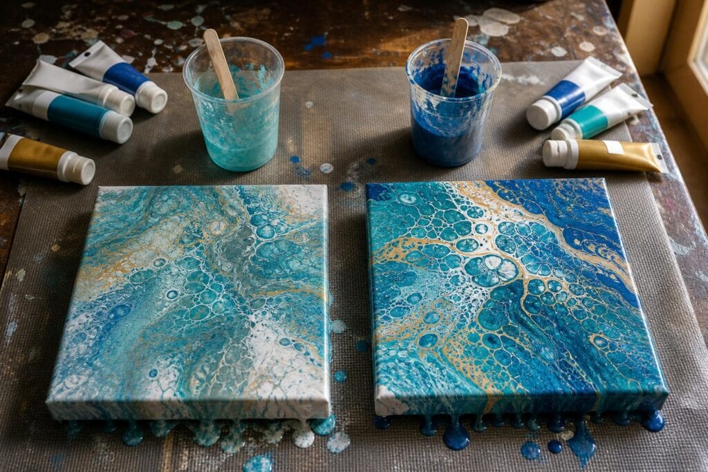
When I started acrylic pouring, I assumed expensive paint would automatically produce better pours. Then I watched a bargain bottle of turquoise create gorgeous cells while a premium red disappeared into muddy brown. Paint quality mattered, but not in the simple way I expected.
For fluid artists, the useful question is not whether premium paint is better. It is whether a particular paint gives you the color strength, consistency, and behavior you need for the pour you are planning. Affordable paint can work beautifully. Premium paint can also be frustrating if you do not adjust your recipe for it.
What You Are Really Paying for in Acrylic Paint
Most of the difference becomes visible when paint is mixed with pouring medium. A paint that looks rich straight from the bottle may become pale or weak once it is stretched across a canvas.
Premium paints usually contain more pigment and less filler. That stronger pigment load helps a color remain visible after pouring medium is added. It can also keep a bold color from being swallowed by white, black, or another dominant shade.
Affordable craft paints tend to contain less pigment and arrive with a thinner consistency. That is not automatically a problem. Their softer body can make them easy to mix, and they often need less medium or water to reach a pourable consistency. For practice pours, swipe experiments, ring pours, and backgrounds, that convenience is genuinely valuable.
You are also paying for consistency from one bottle to the next. In my experience, premium lines are usually more predictable. Some budget paints vary in thickness between colors, even within the same brand. I have opened a blue that flowed almost perfectly from the bottle and a yellow from the same range that felt like soft paste.
This is why one universal pouring recipe rarely works. The label matters less than what the paint is doing in your mixing cup.
How Cheap and Premium Paint Behave in a Pour
Color strength
Premium paint generally keeps its identity when diluted. This is especially noticeable with intense blues, magentas, violets, and greens. A small amount can tint an entire cup, so adding more paint without testing can create a color that overwhelms the composition.
Budget colors often dry less vivid than they looked when wet. I have noticed this most with inexpensive yellows, reds, and purples. They can look cheerful in the cup, then become quiet after spreading thinly over the canvas.
Coverage and transparency
Price does not determine whether a color is transparent. Some premium pigments are naturally transparent, and that transparency can create luminous layering in a dirty pour. It can also make a color appear to vanish when placed beside an opaque white.
One mistake I see often is adding more and more transparent paint because it seems weak. That can throw off the consistency without fixing the real issue. Pairing the transparent color with a more opaque neighbor, using less white, or laying down a related base color usually works better.
Mixing consistency
Heavy premium paint normally needs more pouring medium than craft paint. If both are mixed with identical measurements, the premium cup may remain too thick while the budget cup becomes watery. When those paints meet on the canvas, one moves quickly and the other folds over itself.
I learned this after trying to make every cup obey the same ratio. My white raced toward the edges while a thick blue sat in the center like pudding. Now I adjust each color separately and compare how it falls from the stir stick. I want a steady ribbon that sinks back into the cup without leaving a mound for long.
Drying results
Very inexpensive paint can occasionally dry chalky or less saturated, especially after too much water has been added. Premium paint generally retains richer color, but it is not protected from cracking. A thick layer of artist paint can crack just as easily if the pour is heavy, the surface flexes, or the mixture contains too much paint and too little medium.
What surprised me most was that some of my cleanest dried pours used mostly craft paint. The mixtures were balanced, the paint layer was not excessive, and I did not keep tilting until every interesting shape slid away.
A Simple Side by Side Test
Before replacing your paint collection, test one budget color against one premium color in the same color family.
- Place equal amounts of each paint into separate cups.
- Add pouring medium gradually until both mixtures produce the same flowing ribbon.
- Spread a small sample of each mixture over white, black, and a neighboring color.
- Let the samples dry completely before judging them.
- Note color shift, coverage, surface sheen, and how much medium each paint required.
This test tells you far more than comparing paint straight from the bottle. It also shows whether the stronger pigment justifies the higher price for the way you actually pour.
When Budget Paint Is More Than Enough
I happily use affordable paint for learning a new technique, testing color palettes, covering larger backgrounds, and making pours where I expect to tilt away a lot of paint. It is also useful when I want gentle colors rather than intense saturation.
Budget paint makes sense for beginners because freedom matters. If every cup feels expensive, it is tempting to use too little paint, avoid experiments, or keep trying to rescue a composition that needs to be scraped. Acrylic pouring involves discovery, and affordable supplies make that discovery less stressful.
I would consider upgrading when a favorite color repeatedly dries dull, disappears beside other colors, requires a large amount of paint, or behaves inconsistently from bottle to bottle. Deep reds, bright yellows, rich violets, and highly saturated accent colors are often where an upgrade makes the most visible difference.
My opinion is that beginners do not need a complete premium set. It costs more, requires extra consistency adjustments, and can make color mixing feel precious. A mixed collection is more practical.
Build a Better Paint Collection Without Overspending
I recommend keeping dependable budget paints for white, black, backgrounds, practice pours, and frequently used supporting colors. Add premium paints one at a time where you want stronger impact.
Start with the color that disappoints you most. If your magenta always fades into pink, upgrade the magenta. If your yellow disappears under blue, try a stronger yellow. If your turquoise already pours and dries beautifully, there is no reason to replace it because another bottle has a more impressive label.
Keep a small mixing notebook with the paint name, medium amount, water amount, and dried result. Acrylic pouring recipes become much easier when you can see that one premium blue needs considerably more medium than your craft white.
Troubleshooting Paint Quality Problems
Why did my premium color take over the pour?
It probably has greater tinting strength. Use less of it in the layered cup, reduce the number of layers, or place it beside another strong color rather than several pale budget paints.
Why does my affordable paint look washed out?
Too much pouring medium or water may have stretched the pigment beyond its useful range. Mix a smaller batch with less dilution and compare the dried samples. If it still lacks strength, use it as a background or upgrade that specific color.
Can I combine cheap and premium paints in one pour?
Absolutely. I do it often. Match the final consistency of each cup rather than using identical recipes. The paints do not need the same ingredients in the same amounts. They need to move across the canvas at a compatible speed.
Should I upgrade my white first?
Not necessarily. White is used heavily, and a premium version can become expensive quickly. A reliable budget white is often perfectly useful for bases and negative space. Upgrade only if your current white dries chalky, lacks coverage, or behaves unpredictably in your preferred technique.
The best paint collection is not the most expensive one. It is the collection you understand. When you know which colors dominate, which need extra medium, and which stay vibrant after drying, you can pour with far more confidence than any price label can provide.
