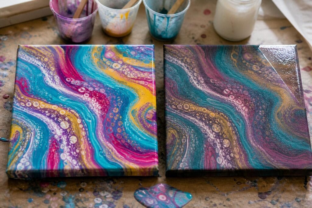
Few things are more disappointing than finishing an acrylic pour with glowing color, only to return the next morning and find that the whole piece looks darker, flatter, or slightly muddy. The turquoise no longer sparkles. The magenta has settled into something closer to burgundy. Those crisp ribbons you loved have softened into less distinct bands.
I have had pours that looked absolutely electric while wet and surprisingly ordinary once dry. For a while, I assumed I had chosen the wrong colors. I eventually realized that several separate things were happening, including normal acrylic color shift, overmixing, weak pigment, changing paint consistency, and the loss of the glossy wet surface.
The encouraging part is that you can control much of this. You may not preserve the exact wet appearance, but you can get much closer with a few deliberate choices.
Why Acrylic Pour Colors Look Different After Drying
Wet acrylic paint contains water and an acrylic binder that can look slightly milky before it cures. As the water evaporates, the binder becomes clear and the paint film contracts. Many colors appear darker as a result. This is especially noticeable in deep blues, violets, reds, and mixtures containing transparent pigments.
The wet surface also reflects light like a temporary gloss finish. That shine makes color look richer and creates stronger contrast between neighboring ribbons. Once the pour dries to a matte or satin surface, light scatters differently and the colors can seem less saturated even when the pigment itself has not faded.
What surprised me most was how much the surface sheen affected my judgment. I once thought a navy, turquoise, and copper pour had lost nearly all its depth. A small test patch of gloss varnish brought back so much richness that I realized the color had not disappeared. The dry surface simply was not showing it at its best.
The Most Common Causes of Dull Acrylic Pours
Too Much Pouring Medium or Water
Pouring medium is useful, but it does not add pigment. If a small amount of paint is stretched through a large amount of medium, the dried color may look weak or translucent. Adding too much water can make this more obvious and may also compromise the strength of the paint film.
One mistake I see often is mixing every color according to one universal ratio. Different brands, colors, and pigment strengths behave differently. A strong phthalo blue may remain vivid when diluted, while a soft yellow or inexpensive violet can disappear quickly.
I prefer to adjust each cup by flow rather than assuming every color needs the same amount of medium. The paint should move easily from the stirring stick in a steady ribbon, but it should still leave a visible trace before sinking back into the cup.
Low Pigment Paint
Craft paint can work in acrylic pouring, and I still enjoy using it for experiments. The tradeoff is that some colors contain less pigment and more filler than artist acrylics. Once they are diluted with pouring medium, they may dry chalky or much less intense.
For beginners who want reliable vibrancy, I recommend spending more on a few important colors rather than buying a large collection of inexpensive bottles. A strong white, a rich blue, a clear red, and one dependable yellow can produce many palettes. This is often more helpful than owning thirty weak colors that become dull as soon as they are mixed.
Colors Mixing on the Canvas
A pour can lose definition before it ever starts drying. Excessive stirring, repeated swiping, aggressive tilting, or very thin paint gives colors more opportunities to blend. Complementary colors are especially quick to create brown or gray mixtures.
I learned this after combining purple, yellow, turquoise, white, and metallic gold in one ambitious flip cup. Every color looked beautiful in its own cup. After a long tilt across a large canvas, the center became a muted greenish brown because I had forced too many opposing colors through one another.
Limit a beginner palette to three main colors plus white or a metallic. Place a buffer color between combinations that may become muddy. White can help, but too much white may create pale, cloudy areas rather than bright contrast.
Continuing Movement During Drying
Your composition does not freeze when you stop tilting. Thin paint continues leveling, cells keep opening, and colors can migrate into one another. A pour that has been diluted too far may lose the crisp lines it had when freshly poured.
An uneven surface can also cause slow drifting toward one edge. I have noticed that even a slightly tilted drying table can stretch cells overnight and collect darker paint along the lower side. Checking the canvas with a level before pouring has saved me more frustration than any clever additive.
How I Keep More Vibrancy From Pour to Finish
- Test the palette first. Place small puddles of your mixed colors next to each other on a scrap tile or primed card. Drag them together once, then let the sample dry. This reveals color shift and muddy combinations before you use a canvas.
- Mix for pigment as well as flow. If a color becomes watery, transparent, or weak in the cup, adding more medium will not rescue it. Add a little more paint or choose a stronger pigment.
- Build intentional contrast. Combine light, medium, and dark values. Two vivid colors of similar value may blend into one flat area, while a deep blue beside white or pale turquoise remains visually distinct.
- Stop tilting sooner. Tilt enough to cover the surface and create the composition, then let the paint settle. Chasing one perfect corner can stretch the entire design and blend colors that were previously clean.
- Dry the pour level and protected. Keep it away from direct sun, strong heat, and blowing air. A box placed over the canvas can reduce dust while still allowing normal air circulation around the edges.
- Choose the finish deliberately. After the pour has fully cured according to the paint and finish instructions, test a compatible gloss varnish on a sample. Gloss usually restores more depth and saturation than matte varnish. Matte finishes can be beautiful, but I would not choose one when the main goal is maximum color intensity.
Simple Tests for a Pour That Dried Dull
Before assuming the painting is ruined, lightly place a piece of clear plastic over a small area without pressing it into the surface. If the colors look richer through the glossy plastic, a gloss finish may restore much of the depth. You can also make a separate dried sample using leftover paint and varnish that first.
If only certain colors faded, compare the paint labels and your mixing notes. Those cups may have contained weaker pigments or more pouring medium. If the entire painting became muddy, the issue was more likely palette interaction, excessive tilting, or paint that was too thin.
If silicone was used, follow the varnish manufacturer’s cleaning and curing guidance before applying any finish. Silicone residue can cause varnish to separate or form bare spots. When I am testing a new palette, I often skip silicone entirely. Fewer variables make it easier to understand what the paint itself is doing.
Troubleshooting Questions
Can I make a dull pour bright again?
A compatible gloss varnish can restore saturation and deepen dark colors, but it cannot separate pigments that already mixed into mud. Test first and wait until the acrylic has cured. Varnishing too early may trap moisture or create an uneven finish.
Does more white always make colors brighter?
No. White makes colors lighter, but it can also reduce saturation and create a pastel or chalky appearance. For cleaner brightness, I often get better results from placing a vivid color beside white rather than mixing a large amount of white into it.
Should I photograph the pour while it is wet?
Absolutely. A wet photograph helps you compare the original palette with the dry result. It also shows whether definition was lost during drying or whether the colors merely changed sheen. Keep notes about brands, ratios, and pouring methods with the photo.
Acrylic pouring always includes some transformation. That is part of what makes fluid art exciting, even when it occasionally tests our patience. The goal is not to force the dried painting to look exactly like the wet pour. It is to understand which changes are normal, reduce the avoidable ones, and choose materials and finishes that let your colors keep the energy that made you love the pour in the first place.
