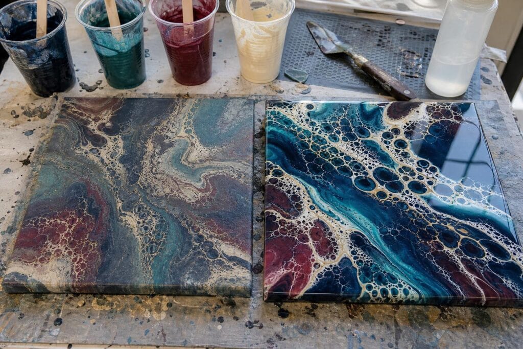
Article style: Troubleshooting guide with a little hard won studio honesty.
There is a particular kind of disappointment that happens when a pour looks luminous, glossy, and full of movement on the table, then dries looking a little chalky, flat, or strangely gray. I have stood over plenty of canvases wondering where the rich turquoise or deep magenta went overnight.
The good news is that a dull dry pour does not automatically mean you mixed it wrong or ruined the painting. In my experience, dullness usually comes from a few very specific places: the paint itself, an overly diluted mix, an uneven surface, colors that muddied while moving, or simply the natural difference between wet acrylic and cured acrylic. Once you know which kind of dull you are seeing, the fix gets much less mysterious.
What a Dull Acrylic Pour Really Looks Like
Not all dull pours have the same problem. Before reaching for varnish, look closely at the canvas in daylight.
If the colors are still strong but the surface looks satin, cloudy, or unevenly shiny, you are mostly dealing with finish dullness. This is often the easiest kind to correct after the pour has cured.
If the whole design looks pale compared with the wet pour, especially in large stretched areas, that is often paint or medium dullness. There may not be enough acrylic binder left near the surface to create that rich color and sheen.
If some areas are vibrant and others look gray or brownish, the issue is usually color mixing during the pour. A glossy varnish can make that area shinier, but it cannot restore a clean blue that blended into orange and white as the paint flowed.
I have noticed that beginners often call all three problems “fading.” They need different solutions, so it helps to separate them before trying to rescue the piece.
The Most Common Reasons Your Colors Lose Their Pop
Your paint and pouring medium are too diluted
One mistake I see often is adding extra water because the paint looks thick in the cup. A little water can be useful, but too much water weakens the acrylic binder. The pour may move beautifully at first, yet dry flatter and feel less durable. It can also create pale, thirsty looking patches where the canvas seems to absorb the color.
I learned this after making several very fluid dirty pours that looked almost like stained glass while wet. They dried with lovely cells, but the dark areas lacked depth and the background had a powdery look. I had chased movement so hard that I had thinned away the richness.
For most acrylic pours, I prefer to get flow from a proper pouring medium first, then make very small water adjustments only if the paint still needs help. The exact ratio depends on the paint brand, but your final mix should pour in a smooth ribbon and settle into itself without feeling watery.
Different paints do not dry with the same sheen
Even in the same color family, craft paint, artist acrylic, metallic paint, and house brand acrylic can dry very differently. Some paints contain more filler and naturally look more matte. Others are heavily pigmented and dry with a deeper, richer face. Mixing a very glossy black with a flat white can create a finish that looks patchy even when the pour itself worked beautifully.
What surprised me most was how often the “dull color” was actually a dull white. A chalkier white can soften every color it touches, especially in blooms, swipes, and pearl cells. If bright white is important to the painting, test it with your usual medium before committing it to a large canvas.
The surface is textured or uneven
Acrylic pours reflect light best when the surface is smooth. Tiny ripples, dry looking cell edges, pinholes, and areas where paint pulled too thin scatter the light instead. The color may be technically there, but it will not look as deep as a smooth glossy area beside it.
This is especially common after lots of torching or after tilting a composition until the paint is stretched very thin at the edges. I still use a quick pass of heat for bubbles, but I gently disagree with the advice to torch repeatedly in pursuit of more cells. Extra heat can disturb a settled surface, encourage pits, and leave the finish less elegant. For beginners, a good mix and a controlled tilt are more useful than aggressive torching.
Your colors blended into mud while the paint moved
Some dullness is actually a color choice problem. Complementary colors such as blue and orange, purple and yellow, or red and green can make exciting contrast when they remain in separate ribbons. When they blend too much, they often turn grayish or brown. White can also cool and mute a color more than expected.
In my experience, the prettiest high contrast pours usually use two or three main colors, one bridge color, and either white or black for structure. When every favorite color goes into one cup, the canvas can become visually busy before it becomes beautiful.
How to Fix a Dull Pour Without Starting Over
First, let the painting cure fully. A pour that feels dry after a day or two may still be releasing moisture and settling beneath the surface. Depending on your paint, medium, humidity, and paint thickness, I like to give a canvas at least two weeks before finishing it. Follow the cure guidance for the products you used if it is longer.
Use a gloss varnish for a dull but otherwise successful pour
If you love the composition and colors but the finish looks flat, a quality acrylic gloss varnish is my first recommendation. It brings the surface to one consistent sheen and often makes dark colors look dramatically deeper. Apply it only on a clean, fully cured painting. Keep the canvas level, use a soft wide brush or the application method recommended by the varnish maker, and avoid going back over areas once they begin to set.
Do a test on a leftover paint skin or small practice tile whenever possible. A varnish is not just shine. It is a clear layer that can reveal every little texture change underneath.
Choose resin only when you want its specific look
Resin can create that deep, glassy finish many pour artists love, but I do not think it is the automatic answer for every dull pour. It costs more, requires careful measuring, can magnify dust and uneven edges, and gives you less room for casual correction. I reserve resin for a piece with a strong composition that I truly want to turn into a statement piece.
For beginners, gloss varnish is kinder, simpler, and easier to practice with. A beautifully varnished canvas often has plenty of shine without the pressure of a resin pour.
Refresh only the areas that truly need help
If a few tiny spots are pale because the paint pulled away, you can carefully add a matching paint mix after the piece is dry, then allow that correction to cure before varnishing. Keep these touch ups small. Trying to repaint a large poured section usually replaces organic flow with obvious brush marks.
If the issue is muddy color, I would not try to paint every muddy cell back into place. Instead, decide whether a finish can make the overall piece feel intentional. Sometimes a glossy topcoat turns a muted pour into something moody and gemstone like. Sometimes it remains a practice piece, and that is useful information for the next canvas.
Simple Habits That Help Future Pours Dry Brighter
Make small test tiles with your regular paint, medium, and favorite colors. Label the back with the ratios. This has saved me more frustration than any online recipe because it shows how my supplies dry in my studio conditions.
Use a consistent base coat. A properly covered, even base helps poured paint travel without grabbing in dry patches. It also prevents thin areas from looking starved against the canvas texture.
Mix enough paint. When the cup runs short, it is tempting to overtilt and stretch the last of the paint across bare spots. That is where rich colors become thin, dull veils. I would rather pour on a smaller canvas than underfill a larger one.
Finally, photograph a pour wet and again after it dries. Over time, you will see patterns. Maybe your metallics stay bright while one white flattens. Maybe a particular medium gives you gorgeous cells but a softer sheen. Those observations are how you build confidence that belongs to your own pouring style.
Troubleshooting Questions
Will varnish make faded colors bright again?
It can deepen and clarify colors that are already present, especially dark blues, blacks, purples, and metallics. It cannot undo color mixing that happened inside the wet paint. Think of varnish as improving the window, not changing the scene behind it.
Why is one side of my acrylic pour shinier than the other?
This often means the paint layer was thicker on one side, the canvas was not level, or different paints settled in different areas. Uneven sheen is usually a finish issue, and a carefully applied gloss varnish can make it look much more uniform.
Can I add more pouring medium to make my next pour shinier?
Only if your current mixture is too paint heavy. More medium is not always more shine. An unbalanced mixture can become overly transparent or behave unpredictably. Start by testing a small batch, and adjust for both flow and dried appearance rather than chasing shine alone.
A dull pour is rarely proof that you are bad at fluid art. It is feedback from the paint. Once you begin noticing whether the problem is sheen, thinning, texture, or muddied color, you can make a calm decision instead of throwing supplies at the canvas. That is when pouring starts to feel less like luck and more like your own creative language.
