Why Some Acrylic Pouring Colors Turn Muddy And Why It Happens So Fast
If you have ever lifted your canvas after a pour and thought, “That looked so good in the cup… what happened?” you are not alone.
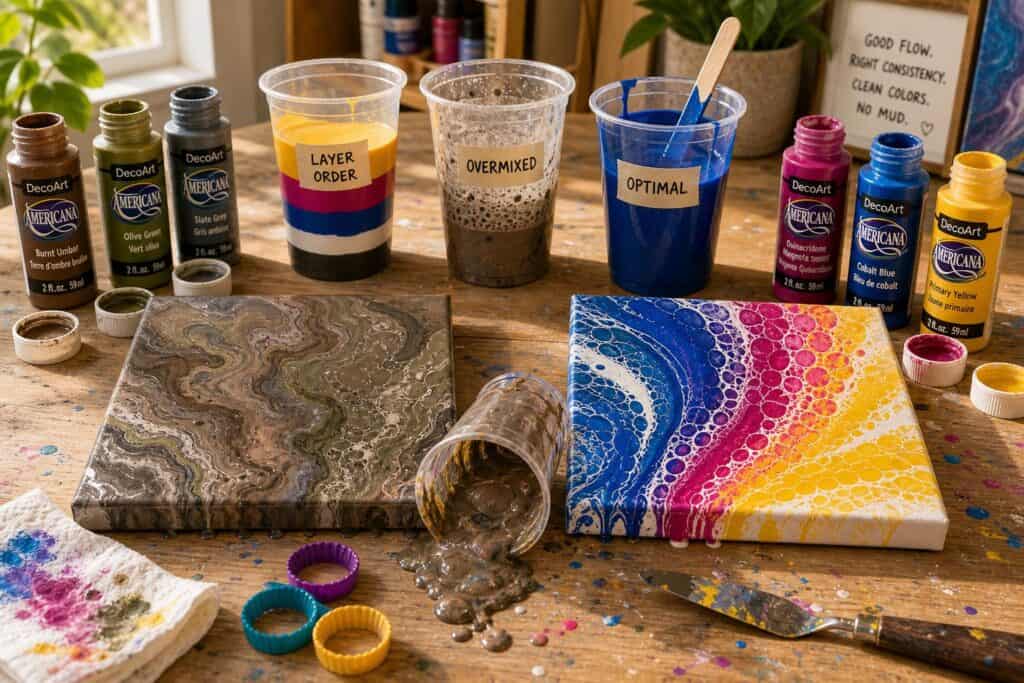
I have noticed that muddy pours rarely look muddy at first. They usually start out vibrant. Bright teal next to coral. A bold swipe of crimson. A touch of metallic gold. Then you tilt. The colors move. They blend just a little too much. And suddenly everything starts turning into a flat, brownish mess.
In acrylic pouring, “muddy” does not always mean pure brown. It can look gray, dull, lifeless, or oddly flat. The sparkle disappears. The depth vanishes. You lose that electric contrast that makes fluid art so satisfying.
What surprised me most when I first started pouring was how fast it happens. One extra tilt. One accidental over mix while layering. One more color added “just because.” Fluid paint blends quickly and permanently. Once it mixes on the canvas, there is no undo button.
The good news is that muddy pours are not random. They are predictable. And once you understand why they happen, you can prevent most of them.
The Color Relationships That Keep Pours Bright
I learned this after ruining more canvases than I care to admit. Mud usually happens when you mix colors that cancel each other out.
Complementary Colors Are Powerful But Risky
Colors opposite each other on the color wheel, like blue and orange or purple and yellow, create beautiful contrast when they sit next to each other. But when they blend evenly in acrylic pouring, they neutralize. That is when you get brown or gray.
In my experience, beginners often pour blue, orange, pink, yellow, and green all into one cup because they love each color individually. Once tilted, those opposites mix together and turn dull.
If you really want to use complementary colors, you need to control how much they blend. Techniques like a controlled swipe or minimal tilting can help keep them distinct.
Analogous Colors Stay Cleaner
When I want a guaranteed vibrant result, I stick to colors that sit next to each other on the color wheel. Think blue, turquoise, and green. Or pink, red, and orange.
These combinations naturally blend into each other without turning brown. They create gradients instead of mud.
For beginners, this is the approach I recommend most. It removes one major risk factor and lets you focus on paint consistency and movement instead of fighting color chaos.
Some artists say you should use every color you love. I gently disagree for beginners. Restraint creates cleaner, more professional looking pours.
Common Beginner Mistakes That Lead to Brown
One mistake I see often is simply using too many colors.
Using Five Or More Strong Colors in One Cup
When you layer many bold colors in a dirty pour cup, they inevitably interact. Even if you pour carefully, tilting forces them through each other.
I eventually realized that my cleanest pours usually contain three or four colors plus white. That is it. The simplicity keeps the flow interesting without overwhelming the surface.
Over Tilting the Canvas
This one took me a long time to accept. Sometimes we ruin a good pour because we cannot stop trying to “improve” it.
Every tilt blends the edges a little more. Every extra pass smooths out those sharp, gorgeous lines. If you continue until every corner is covered perfectly, you may also be mixing your colors into neutrality.
In my own studio practice, I now stop tilting earlier than feels comfortable. I let some thicker areas remain. That slight imperfection often protects the vibrancy.
Stirring Too Aggressively in the Cup
Many beginners accidentally pre mix their colors.
If you layer your paints in a cup and then tap it hard or shake it, the colors start blending before they even hit the canvas. By the time you pour, they are already halfway to brown.
Gentle layering is key. Pour slowly down the side of the cup. Avoid stirring unless you are intentionally creating a marble base.
Ignoring Paint Consistency
If some colors are thinner and others are thicker, the thinner ones push aggressively through the thicker ones during tilting. That extra mixing can create unwanted blending.
I have noticed that when all my paints are similar in consistency, the colors slide rather than churn. The result is cleaner separation and brighter cells.
Simple Ways to Keep Your Colors Bright and Beautiful
Limit Your Palette Intentionally
Try this simple formula for your next pour.
Choose one dominant color.
Add one or two neighboring colors.
Include white for contrast and cell development.
This structure gives you harmony and movement without chaos.
Use White Strategically
White is often what saves a pour from muddiness. It creates breathing space between stronger pigments. It also helps form cells that separate colors naturally.
However, too much white can soften everything and create a pastel effect. That is the tradeoff. If you want bold jewel tones, keep the white controlled rather than flooding the canvas.
Think About Layer Order
Layering darker colors alternated with lighter ones in your cup can influence how they emerge.
I have found that placing white between two strong complementary colors reduces direct mixing. For example, blue, white, orange instead of blue directly touching orange. That slight buffer sometimes keeps them from fully neutralizing.
Choose the Right Technique for Your Palette
Dirty pours encourage blending. Swipes and controlled ring pours give you more separation.
If you are experimenting with risky color combinations, I recommend a swipe technique for beginners. It allows the colors to interact while still maintaining clear areas of contrast.
Full canvas tilting dirty pours are beautiful, but they are less forgiving.
Troubleshooting Muddy Pours
Why Did My Purple Turn Brown?
Check if yellow or a warm gold was included. Even a small amount can neutralize purple quickly when mixed thoroughly.
Why Do My Metallics Look Dull?
Metallic paints often lose shine when over mixed with opaque colors. Try swiping metallics on top instead of burying them in the cup.
Can I Fix a Muddy Pour?
Sometimes you can add a swipe of clean white or a fresh contrasting color on top while the paint is still wet. But often the better solution is to learn from it and pour again.
I have scraped many canvases back into the cup and started over. It is part of becoming confident.
The Bigger Lesson
In fluid art, color choice matters just as much as movement.
I used to think muddy pours meant I lacked talent. What I eventually realized is that they usually meant I was being overly ambitious with my palette or too heavy handed with movement.
Clean, vibrant pours come from thoughtful limitation. Fewer colors. More intention. Gentler tilting. Consistent paint.
If you are just starting out, give yourself permission to keep it simple. Master three color combinations before attempting seven. Observe how they interact. Notice which pairs blend beautifully and which ones collapse into brown.
The more you experiment with awareness, the more confident your color choices will become. And when your colors stay bright and bold across the canvas, that is when acrylic pouring feels almost magical.
Not because it is accidental. But because you finally understand what your paint is trying to do.
And now you can guide it instead of fighting it.
