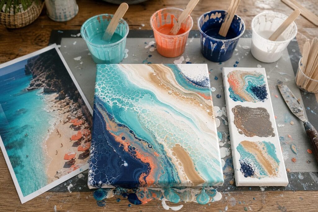
Some of my favorite acrylic pour palettes started with vacation photos that were not especially impressive as photographs. A hazy sunset, a weathered doorway, or a glimpse of ocean between two buildings may not be the picture I frame, but it can still hold a beautiful combination of colors.
Vacation photos are useful because they give you more than random inspiration. They contain color relationships that already existed together in a real place. Just as importantly, they carry a memory. When you turn those colors into fluid art, the finished pour can feel personal without needing to resemble a literal landscape.
The challenge is knowing which colors to pull from the photo. If you try to include every shade you see, the pour can become visually noisy or muddy. I learned this after turning a peaceful coastal photo into a chaotic canvas filled with three blues, two greens, coral, sand, white, and gold. Every color made sense individually. Together, they fought for attention.
Look for the Color Story, Not Every Color
I recommend choosing four colors for your first vacation inspired palette. Five can work, but four is easier to control when you are still learning how colors interact inside a cup and across a moving canvas.
Instead of using a digital color picker on every interesting area, look at the photograph for a few seconds and ask what you notice first. That first impression is usually more useful than an exact pixel sample. Phone cameras alter saturation, shadows, and brightness anyway, so perfect color matching is less important than capturing the atmosphere.
I divide the palette into four simple roles:
- One anchor color. This is the color that best represents the place or memory. It might be deep ocean blue, terracotta, forest green, or warm sunset orange.
- One supporting color. Choose a nearby color that expands the mood without competing with the anchor. Teal can support blue, while peach can support coral.
- One light resting color. White, cream, pale gray, or a softly tinted neutral gives the more active colors space to form readable lines and cells.
- One accent color. This is the small surprise in the photo, such as a yellow umbrella, a red flower, or the turquoise trim on a building.
I have noticed that the smallest color in a photograph often becomes the most powerful color in an acrylic pour. A tiny patch of yellow may look harmless on the screen, but yellow poured beside blue can spread into green and change the entire piece. Treat the accent as seasoning rather than a full serving.
A Simple Way to Build a Balanced Palette
Start by cropping the photo. Remove distracting objects and focus on the portion that holds the mood you want. A beach photo might become much easier to interpret when you crop out the bright towels and keep only the water, sand, foam, and a small piece of sky.
Next, assign each chosen color a visual proportion. I often begin with about half anchor color, one quarter supporting color, and smaller amounts of the light color and accent. These proportions do not need to be measured precisely. They are simply a reminder that every color should not receive equal space.
One mistake I see often is mixing equal cups of every color because equal amounts feel organized. In a dirty pour, those equal amounts can create a striped result with no clear focus. Worse, complementary colors may blend in the cup and produce gray or brown before they reach the canvas.
My opinion is that beginners should simplify the photograph rather than prove how accurately they can reproduce it. You give up some literal detail, but you gain cleaner color movement and a stronger composition. Complex palettes can be beautiful, although they leave less room for error when paint layers fold together.
Test the Colors Before Committing to a Canvas
A row of dry swatches will not tell you everything. Acrylic pouring colors change when they are diluted with pouring medium, layered in a cup, stretched over a surface, and dried. I recommend making a small fluid test instead.
- Mix each paint with your usual pouring medium until the colors have similar flow. Lift the stir stick and watch the paint fall back into the cup. Each stream should leave a brief trace before sinking into the surface.
- Place a spoonful of each mixed color on a piece of coated card, a small tile, or an inexpensive canvas panel.
- Drag the colors gently into one another with a craft stick. This reveals which pairings stay distinct and which immediately become dull.
- Make a tiny layered cup using the same order you plan to use in the final pour. Pour a small puddle and tilt it.
- Let the test dry completely. Some blues and metallics darken noticeably, while inexpensive light colors may become more transparent.
What surprised me most when I began doing these tests was how often the palette looked balanced in separate cups but felt completely different once stretched. A dark navy that seemed elegant could take over half the test. A pale peach could disappear beneath an opaque white. The test gives you a chance to correct those problems without scraping a full canvas.
Adjusting a Palette That Is Not Working
The colors look muddy
Check whether you selected colors that neutralize each other, such as blue with orange or red with green. You do not always need to remove one. Try placing a layer of white, cream, or a related color between them in the pouring cup. You can also use a flip cup with less stirring instead of combining everything aggressively in one dirty pour.
If the palette contains several complementary pairs, simplify it. Removing one paint is usually more effective than adding another color to rescue the mixture.
One color overwhelms everything
Reduce that color in the cup, but also check its opacity and consistency. A very fluid paint can travel farther during tilting, while an opaque paint may cover transparent layers. I eventually realized that volume alone does not determine dominance. Flow and pigment strength matter just as much.
The palette feels too busy
Choose either the supporting color or the accent, not both. Another option is to tint the light color with a tiny amount of the anchor color. That creates a quieter connection across the pour without introducing a completely new hue.
The dried test feels flat
Add contrast rather than adding several colors. Deepen the anchor, lighten the neutral, or introduce a restrained metallic accent. Gold can evoke warm sunlight, while pearl white can suggest glare on water. Metallic paint is effective in small amounts, but too much can dominate the memory you were trying to capture.
Match the Pouring Technique to the Memory
Once the palette works, think about how the place felt. I like a ring pour for photographs with visible layers, such as mountains, cliffs, or bands of sunset color. A traveling ring pour introduces movement while preserving more separation between the selected shades.
For ocean photos, I often prefer a straight pour or a gentle swipe because the elongated movement can suggest currents and foam. A flip cup creates more energetic mixing, which may suit a lively market, colorful street, or amusement park memory.
Beginners are sometimes told to choose the technique first and find colors afterward. I gently disagree when the goal is a meaningful vacation piece. Let the palette and memory suggest the movement. A calm misty lake may not benefit from an explosive cup full of high contrast cells, even if the technique is fun.
Let the Finished Pour Be Its Own Memory
Your acrylic pour does not need to look like the photograph. The ocean may become a ribbon of teal, and a sunset may appear only as a thin coral line. That is not a failure of accuracy. Fluid art translates the mood through movement, color, and the unpredictable places where paint meets paint.
Keep the photograph nearby while you work, but stop checking it once you begin tilting. Watch the composition forming on the canvas. Preserve the areas where the colors are doing something beautiful, even if they do not match the original scene.
In my experience, the most satisfying vacation inspired pours feel familiar without explaining themselves. You remember the warm stone, bright water, evening sky, or faded hotel walls, while someone else simply sees a balanced abstract painting. That combination of private meaning and visual freedom is exactly what makes vacation photos such rich color references for acrylic pouring.
