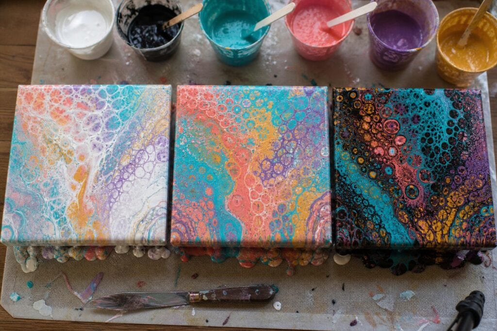
Black and white look like simple additions to an acrylic pouring palette. White makes colors lighter, black makes them darker, and that seems like the end of the story. In an actual pour, though, they can change the entire mood, movement, and visual balance of the piece.
I learned this after making several pours with nearly identical bright colors. The pours that included white felt open and airy, while the ones with black looked deeper and more dramatic. When I used too much of either one, the results became washed out, harsh, or strangely disconnected. The color choices had not changed much, but the relationships between those colors had.
That is the useful way to think about black and white in fluid art. They are not just extra colors. They influence how every other color is seen.
Why Black and White Do More Than Darken or Lighten Paint
In acrylic pouring, value is the difference between light and dark areas. A palette with strong value differences usually has clearer shapes, more visible ribbons, and better separation after the paint spreads. A palette with very similar values can still be beautiful, but its movement tends to look softer and less defined.
Black and white create those value differences quickly. They also affect saturation. Adding white directly to a color creates a tint, which often makes the color look softer or more pastel. Adding black can make a color appear muted rather than simply darker, especially with yellow, orange, and some reds.
Paint behavior matters too. Titanium white is often dense and opaque. Depending on the brand, pouring medium, and layering order, it may sink around lighter paints or help create visible cells. Black is usually strongly pigmented, so a small amount can travel farther than expected when the canvas is tilted.
This is why measuring only by the size of each puddle can be misleading. Two equal portions of paint may not have equal visual power.
How White Changes the Look of a Pour
White is excellent for giving saturated colors room to breathe. In a straight pour or ring pour, narrow bands of white can separate neighboring colors and preserve the pattern as it expands. In a Dutch pour, white negative space can make wispy color edges feel more deliberate.
One mistake I see often is adding white to every cup because the artist wants a light, cheerful palette. Once every color has been heavily tinted, there may be very little value contrast left. Pink, pale blue, lavender, and mint can merge into one soft area, even if they looked distinct before pouring.
I have noticed that white works best when I give it a specific job. I might use it as the base, place thin white layers between stronger colors, or mix it into only one or two colors. I rarely do all three in the same beginner pour because the palette can lose its focal areas.
There is also a tradeoff. More white can make a pour feel spacious and luminous, but it can reduce the intensity that attracted you to the colors in the first place. I prefer keeping at least one color close to its original saturation. That saturated color becomes an anchor among the softer tints.
How Black Adds Drama Without Taking Over
Black can make turquoise look brighter, metallic gold look warmer, and magenta look more electric. It does this through contrast, not by changing those colors in the cup. Even a narrow black line can give nearby colors a sharper edge.
What surprised me most was how little black I needed. In one early flip cup, I used black in roughly the same quantity as blue, violet, and silver. After tilting, black occupied most of the canvas. The brighter colors survived as small islands, but the lively palette I had planned was gone.
Now I usually treat black as an accent unless I intentionally want a dark negative space pour. I use a smaller portion, layer it less frequently, and avoid placing it directly beside colors that muddy easily. Yellow touching black, for example, can create an olive or greenish transition. Red and black can become a heavy brownish maroon where they blend.
Some common advice says to place white or black between every color to prevent muddying. I do not think that is the most helpful approach for beginners. It adds more paint and more interfaces where colors can interact. I recommend separating only the combinations that truly need help, then allowing compatible colors such as blue and violet to meet naturally.
Build Visual Balance Before You Pour
Black and white do not need to appear in equal amounts. Balance in a pour is visual, not mathematical. A small black area can balance a much larger pale area because black carries more visual weight.
Before mixing paint, I decide which of these roles I want:
- White as space: Use white as the base or negative space around concentrated color.
- White as separation: Add a few thin layers to preserve ribbons and rings.
- Black as an accent: Use small amounts to outline movement and intensify bright colors.
- Black as space: Use a black base for a moody pour with luminous color over it.
Choosing one main role prevents both neutrals from competing with the palette. It also makes troubleshooting much easier if the pour does not behave as expected.
A Simple Test Before Your Next Pour
I recommend a small tile test instead of guessing on a full canvas. Swatching colors on dry paper is less helpful for pouring artists because it does not show how fluid paint stretches, overlaps, or dries.
- Mix your colors, black, and white to the same pouring consistency you plan to use.
- Prepare three small tiles, canvas panels, or pieces of sealed card.
- Pour the first sample using only the colors.
- Pour the second with white added in the role you are considering.
- Pour the third with a small amount of black.
- Tilt each sample in a similar way and let all three dry completely.
Compare the dried results rather than judging only while wet. Acrylic paint often dries darker, and glossy wet surfaces can make contrast look stronger than it will later. Look for which colors stayed recognizable, whether the composition has light and dark areas, and whether black or white became the first thing you notice.
Troubleshooting Black and White in Acrylic Pours
Why did my colorful pour become mostly white?
You may have used white as a base, mixed it into several colors, and layered additional white in the cup. Reduce one of those sources. Also check consistency. Very fluid color can slide away while a thicker white remains visually dominant.
Why did black swallow my colors?
The black portion may have been too large, layered too often, or more fluid than the other paints. Start with about half the amount your eye tells you to use. You can always add black to a future pour, but you cannot pull it back once it spreads through the cup.
Why do my pastel colors look dull?
Too much white may have reduced the saturation of every color. Keep one or two colors stronger, and use white beside them rather than inside all of them. This creates softness without making the entire pour feel faded.
Can I use both black and white?
Absolutely, but give each one a different job. Try a white base with a few narrow black accents, or a black base with small white highlights. For a first experiment, avoid using large amounts of both inside the same layered cup. The extreme contrast can fragment the design and make the result harder to control.
If black and white have been unpredictable in your pours, that does not mean you lack a good eye for color. They are powerful pigments with their own behavior. Test them in small amounts, assign each one a purpose, and let your brightest colors keep some of their original voice.
