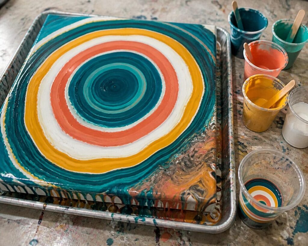
A ring pour can look beautifully organized in the cup and then become a blurry puddle the moment it reaches the canvas. I know because I have made plenty of those puddles. The colors were attractive, the ratios seemed reasonable, and my circular motion felt steady, yet the finished rings looked soft, muddy, or almost completely lost.
I eventually realized that ring definition does not come from one special wrist movement. It comes from several choices working together. Paint consistency protects the layers, cup loading determines the order in which colors appear, and your pouring motion controls how much those layers stretch and mingle.
If you are learning ring pours, I recommend practicing without silicone and with a limited palette. Silicone can create interesting cells, but it also interrupts the clean bands you are trying to understand. Clear rings first, extra effects later.
Why Ring Pour Colors Blend Together
Some blending is part of the beauty of fluid art. The trouble begins when the paint mixes before it has a chance to form visible rings.
Paint that is too thin is the most common cause. Thin colors rush out of the cup, slide through one another, and continue mixing while you tilt. If one color is much thinner than the others, it may cut through several layers and take over the composition.
I have noticed this most often with white. A thin white can travel surprisingly far through a cup and turn strong colors into pale, cloudy versions of themselves. Beginners sometimes assume they used too much white when the real problem was that the white moved more freely than everything around it.
Excessive handling can also soften the rings. Pouring from high above the canvas drives the stream into the puddle with more force. Fast circles fold neighboring colors together. Aggressive tilting stretches delicate bands until they disappear.
The goal is not to prevent every interaction between colors. The goal is to give each band enough structure to remain visible while still flowing as part of the whole pour.
Choose Colors That Can Stay Distinct
A ring pour is not very forgiving of a crowded palette. Every color touches at least one other color, and repeated stretching creates additional contact. Five exciting colors can quickly produce one tired brown if their mixtures are not considered.
For a first practice pour, I prefer three colors plus a small amount of white or another light neutral. An analogous palette is especially manageable. Blue, turquoise, and green will usually mingle more gracefully than blue, orange, red, green, and purple in the same cup.
You can still include contrast. The simplest approach is to use one accent color and keep it away from the color most likely to neutralize it. For example, if I am using turquoise, violet, white, and a warm gold, I place white or violet between the turquoise and gold layers. That buffer does not guarantee separation, but it reduces direct mixing.
One mistake I see often is placing complementary colors next to each other repeatedly because they look dramatic in the bottles. Blue beside orange or red beside green can be gorgeous in a ring pour, but the boundary between them may become gray or brown. Use that contrast deliberately and sparingly.
I also gently disagree with the common suggestion to put white between every color. It can work, but beginners often end up with a mostly white pour containing faint pastel lines. I would rather use white as an occasional separator and let compatible colors touch elsewhere.
Layer the Cup Without Stirring It
The way paint enters the cup matters. Dropping each color forcefully into the center encourages it to plunge through the previous layers. Pouring slowly against the inside wall creates gentler strata.
My preferred beginner method is a repeated sequence of small layers. If the palette is navy, turquoise, white, and gold, I might load navy, turquoise, a little white, gold, and turquoise, then repeat the sequence. Smaller repeated layers usually create more rings than four large blocks of color.
What surprised me most during my own experiments was how little paint is needed for a visible accent. Metallic gold can expand into several bold lines even when it occupies a modest portion of the cup. A heavy gold layer may sink, spread, and visually dominate the entire pour.
Try to load the cup shortly before pouring. Leaving a layered cup on the table for a long time gives paints with different densities more opportunity to shift. There is no need to panic or race, but I would not mix a ring pour cup and then leave it sitting while I prepare the canvas.
Match the Paint Consistency Before You Pour
For defined rings, I like paint that flows in a continuous ribbon and briefly leaves a trace on the surface before settling in. It should not fall in clumps, but it should not disappear like colored water either.
More important, every color should behave similarly. Test each mixture with the same stirring stick and from the same height. If turquoise runs off immediately while violet stretches into a slow ribbon, adjust them before loading the cup.
I learned this after blaming several palettes for muddy results. The colors were not the real problem. My heavy body blue was much thicker than my fluid white, even though I had added the same measured amount of pouring medium to both. Different pigments and paint lines do not always reach the same consistency with an identical recipe.
There is a tradeoff here. Slightly thicker paint holds clearer rings, but it spreads more slowly and may require additional paint or careful tilting to cover the canvas. Very thin paint covers easily, but sacrifices definition. For beginners, I recommend favoring ring clarity and accepting a slower spread. It is easier to learn the motion when the bands are not vanishing instantly.
Use a Calm, Close Pouring Motion
Begin near the center of a level canvas with the cup held close to the surface.
Pour a small central puddle before beginning your circular motion. This gives the next rings a stable place to land.
Move the stream in small, steady circles. Let the paint create the pattern rather than drawing large loops with your whole arm.
Keep the stream consistent. Sudden stops can create thick bands, while sudden surges can bury narrow ones.
As the cup empties, bring it even closer to the surface. The final paint often exits less predictably.
In my experience, slow circles produce more readable rings than rapid circles. A faster motion may create many narrow bands, but those bands are fragile and can disappear during tilting. Wider, calmer rings give you more room to stretch the design.
Tilt in stages. Move the puddle toward one edge, return it closer to center, then approach another edge. If you send all the paint hard toward one corner, the rings on that side may stretch into plain stripes while the opposite side remains crowded.
Troubleshooting Muddy or Uneven Ring Pours
Why did my rings disappear immediately?
Your mixtures were probably too thin, poured from too high, or moved in circles too quickly. Thicken the next batch slightly and hold the cup closer to the canvas. Change one variable at a time so you can see what actually improves the result.
Why is one color taking over?
Compare its consistency and quantity with the other colors. A thinner paint can travel through the cup, while a dense metallic may sink and emerge in unexpected places. Use less of the dominant color in the next cup rather than removing it completely.
Why are my rings clear in the center but muddy near the edges?
The initial pour worked, but the tilting stretched the outside bands too far. Use enough total paint to cover the canvas without forcing every ring to travel an extreme distance. You can also preserve a favorite area by tilting away from it first.
Why do my rings look lopsided?
Check that the canvas and work surface are level. Also watch whether your hand circles evenly around the center. Lopsided rings are not automatically a failure, though. Some of my favorite pours became more interesting after the center drifted and the rings opened into a flowing, off center composition.
For your next practice session, use the same four colors in two small cups. Make one cup slightly thinner and pour it faster. Keep the other cup a little thicker and use slow, close circles. That simple comparison will teach you more about color separation than chasing a perfect recipe, and you may discover that the version with the clearest rings is not the only one worth keeping.
