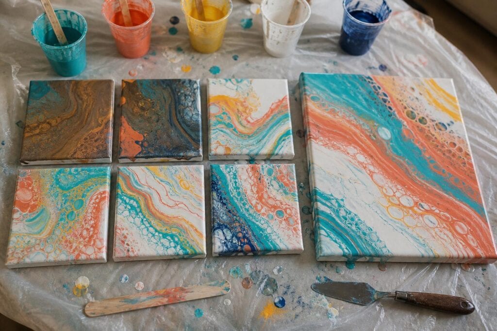
Following a proven acrylic pouring color recipe can be reassuring, especially when you are still learning how paint moves across a canvas. The trouble is that a recipe only tells you what worked for someone else. It does not show you how your turquoise behaves beside your copper, how much violet your white can tolerate, or what happens when your favorite red stretches into a thin ribbon.
I have noticed that my understanding of color has grown fastest when I test combinations in small, low pressure pours. Those experiments let me watch colors stretch, overlap, form cells, and occasionally turn into something resembling wet cement. Even an unattractive result gives me information I can use in the next pour.
Why Color Experiments Teach More Than Recipes
Acrylic pouring colors do not remain in tidy patches. They travel through one another. A color that looks beautiful beside another color on a palette may behave very differently when both are thinned with pouring medium and pulled across a canvas.
For example, blue and orange can create a dramatic contrast when they stay mostly separate. Put them together in a flip cup with a lot of movement, however, and they can produce gray or brown areas. The recipe is not necessarily bad. The amount of contact between the colors has changed.
In my experience, the pouring technique is part of the color combination. A palette may work wonderfully in a ring pour because the bands remain relatively organized, yet become muddy in a flip cup where the paint tumbles together. A swipe can preserve an accent color near the surface, while excessive tilting may stretch that same accent until it dominates the whole composition.
This is why I gently disagree with the advice to simply collect successful color recipes. Recipes are useful starting points, but beginners learn more by changing one part of a familiar palette and observing what happens.
My Favorite Way to Test Colors Without Wasting Paint
I recommend making small pours on four inch canvas panels or inexpensive ceramic tiles. A paper swatch can show whether two colors look pleasant beside one another, but it cannot reveal how they will layer, stretch, or mix during an actual pour. A miniature pour uses a little more paint than a swatch, but it gives far more useful information.
1. Begin With Three Colors and White
Choose one main color, one supporting color, one accent, and white or another light neutral. Limiting the palette makes it easier to identify what caused an unexpected result. Starting with seven exciting colors may feel adventurous, but it gives a beginner too many interactions to evaluate at once.
A practical test might include deep turquoise, light blue, copper, and white. Another could use magenta, violet, gold, and white. If you want to test a potentially risky complementary pairing, use one of those colors sparingly as the accent.
2. Keep the Paint Consistency Similar
Color testing becomes confusing when one paint is thick and another is extremely thin. The thin paint may race across the surface or sink beneath a heavier layer, making you think the color combination failed when the real problem was consistency.
Mix each color with the same general pouring medium recipe, then check how it flows from the stir stick. It does not need to be mathematically perfect. You simply want the paints to fall in similar ribbons so color remains the main variable.
3. Use the Technique You Actually Want to Learn
If you usually make ring pours, test the palette with a small ring pour. If you are exploring swipes, perform a miniature swipe. Randomly puddling the colors together may save time, but it does not show how they will behave in your preferred technique.
I learned this after approving several palettes in small puddle tests and then disliking them in larger flip cups. The extra tumbling created far more color mixing than the test had shown.
4. Record the Layering Order
Take a quick photo of the filled cup or write the color order in a notebook. Layering white between two colors can create separation. Placing those same colors directly against each other may encourage blending. If a result is beautiful, you will want to know more than the names printed on the paint bottles.
5. Change Only One Thing in the Next Test
Replace copper with gold, reduce the amount of violet, or move white between two risky colors. Do not change the palette, consistency, technique, and cup order all at once. One controlled change makes the result easier to understand and repeat.
What Muddy Pours Can Teach You
One mistake I see often is blaming every muddy area on poor color choices. Sometimes the palette is perfectly workable. The colors were simply mixed too much through stirring, repeated tilting, or aggressive torching and manipulation.
When a test becomes muddy, look at where the dull color appeared. Mud around the edges often points to excessive tilting, since that paint traveled the farthest and blended repeatedly. Mud throughout a flip cup may indicate too many colors layered directly together. A dull patch between two specific colors reveals an interaction worth separating next time.
What surprised me most was how often white contributed to disappointing results. Too much white can soften a rich palette until every color looks chalky. Some whites also sink or create strong cells that break apart clean bands. White is not automatically a safe solution for every palette.
Metallic paints bring another tradeoff. I love the shimmer and depth they can add, but they often have a different weight and consistency from standard acrylics. A large amount of metallic paint can overtake delicate colors or settle into unexpected areas. For beginners, I prefer using metallics as accents until their movement becomes familiar.
Do not immediately discard an unsuccessful tile. Let it dry. Wet acrylic pouring paint can look darker, cloudier, and less balanced than the finished surface. I have had pours that looked hopeless while wet but developed beautiful separation and metallic detail after curing.
Turning Experiments Into a Personal Color Style
A personal acrylic pouring style rarely arrives as one perfect palette. It develops when you notice the decisions you enjoy repeating.
Review your test pieces and look for patterns. You may consistently prefer dark backgrounds with bright turquoise movement. You may like warm metallic accents but dislike large metallic sections. Perhaps your favorite pours contain closely related blues with one sharp coral interruption.
Choose two or three successful experiments and repeat them using different techniques. Try the same palette in a ring pour, a swipe, and a straight pour. Notice which technique preserves the color relationships you liked in the original test.
I eventually realized that I prefer a dominant color family, a generous neutral, and one restrained contrasting accent. That structure gives me variety without making the pour feel visually noisy. Your preferred structure may be completely different, and that is the point. Repeating experiments turns preference into practical knowledge.
Troubleshooting Color Experiments
Why did my small test work but my large pour failed?
A larger canvas requires more tilting and gives the colors farther to travel. Use enough paint for good coverage, keep your ratios similar, and avoid stretching the design more than necessary.
Should I test every new paint color?
I would test any color that is unusually opaque, transparent, metallic, or much heavier than the paints you normally use. These differences can affect both the appearance and movement of the pour.
How many experiments should I make before using a full canvas?
Two or three focused tests are usually enough. The goal is not to eliminate every surprise. Acrylic pouring would lose much of its magic if everything were predictable. You are simply learning enough to make the surprise interesting rather than expensive.
Keep the experiments small, keep the variables understandable, and give imperfect results time to teach you something. Every test helps you recognize what your paints are likely to do before you commit a full cup of color to a larger canvas.
